Mapping Traffic Fatalities
01 Sep 2016
On Monday, August 29, DJ Patil, the Chief Data Scientist in the White House Office of Science and Technology Policy, and Mark Rosekind, the Administrator of the National Highway Traffic Safety Administration (NHTSA), announced the release of a data set documenting all traffic fatalities occurring in the United States in 2015. As part of their release, they issued a “call to action” for data scientists and analysts to “jump in and analyze it.” This post does exactly that by plotting these fatalities and providing the code for others to reproduce and extend the analysis.
Step 1: Download and Clean the Data
The NHTSA made downloading this data set very easy. Simply visit ftp://ftp.nhtsa.dot.gov/fars/2015/National/ and download the FARS2015NationalDBF.zip file, unzip it, and load into R.
library(foreign)
accidents <- read.dbf("FARS2015NationalDBF/accident.dbf")
Since the goal here is to map the traffic fatalities, I also recommend subsetting the data to only include rows that have valid coordinates:
accidents <- subset(accidents, LONGITUD!=999.99990 & LONGITUD!=888.88880 & LONGITUD!=777.77770)
Also, the map we’ll be producing will only include the lower 48 states, so we want to further subset the data to exclude Alaska and Hawaii:
cont_us_accidents<-subset(accidents, STATE!=2 & STATE!=15)
We also need to load in data on state and county borders to make our map more interpretable – without this, there would be no borders on display. Fortunately, the map_data function that’s part of the ggplot2 package makes this step very easy:
library(ggplot2)
county_map_data<-map_data("county")
state_map <- map_data("state")
Step 2: Plot the Data
Plotting the data using ggplot is also not particularly complicated. The most important thing is to use layers. We’ll first add a polygon layer to a blank ggplot object to map the county borders in light grey and then subsequently add polygons to map the state borders. Then, we’ll add points to show exactly where in the (lower 48) United States traffic fatalities occurred in 2015, plotting these in red, but with a high level of transparency (alpha=0.05) to help prevent points from obscuring one another.
map<-ggplot() +
  #Add county borders:
  geom_polygon(data=county_map_data, aes(x=long,y=lat,group=group), colour = alpha("grey", 1/4), size = 0.2, fill = NA) +
  #Add state borders:
  geom_polygon(data = state_map, aes(x=long,y=lat,group=group), colour = "grey", fill = NA) +
  #Add points (one per fatality):
  geom_point(data=cont_us_accidents, aes(x=LONGITUD, y=LATITUDE), alpha=0.05, size=0.5, col="red") +
  #Adjust the map projection
  coord_map("albers",lat0=39, lat1=45) +
  #Add a title:
  ggtitle("Traffic Fatalities in 2015") +
  #Adjust the theme:
  theme_classic() +
  theme(panel.border = element_blank(),
        axis.text = element_blank(),
        line = element_blank(),
        axis.title = element_blank(),
        plot.title = element_text(size=40, face="bold", family="Avenir Next"))
Step 3: View the Finished Product
With this relatively simple code, we produce a map that clearly displays the location of 2015’s traffic fatalities: 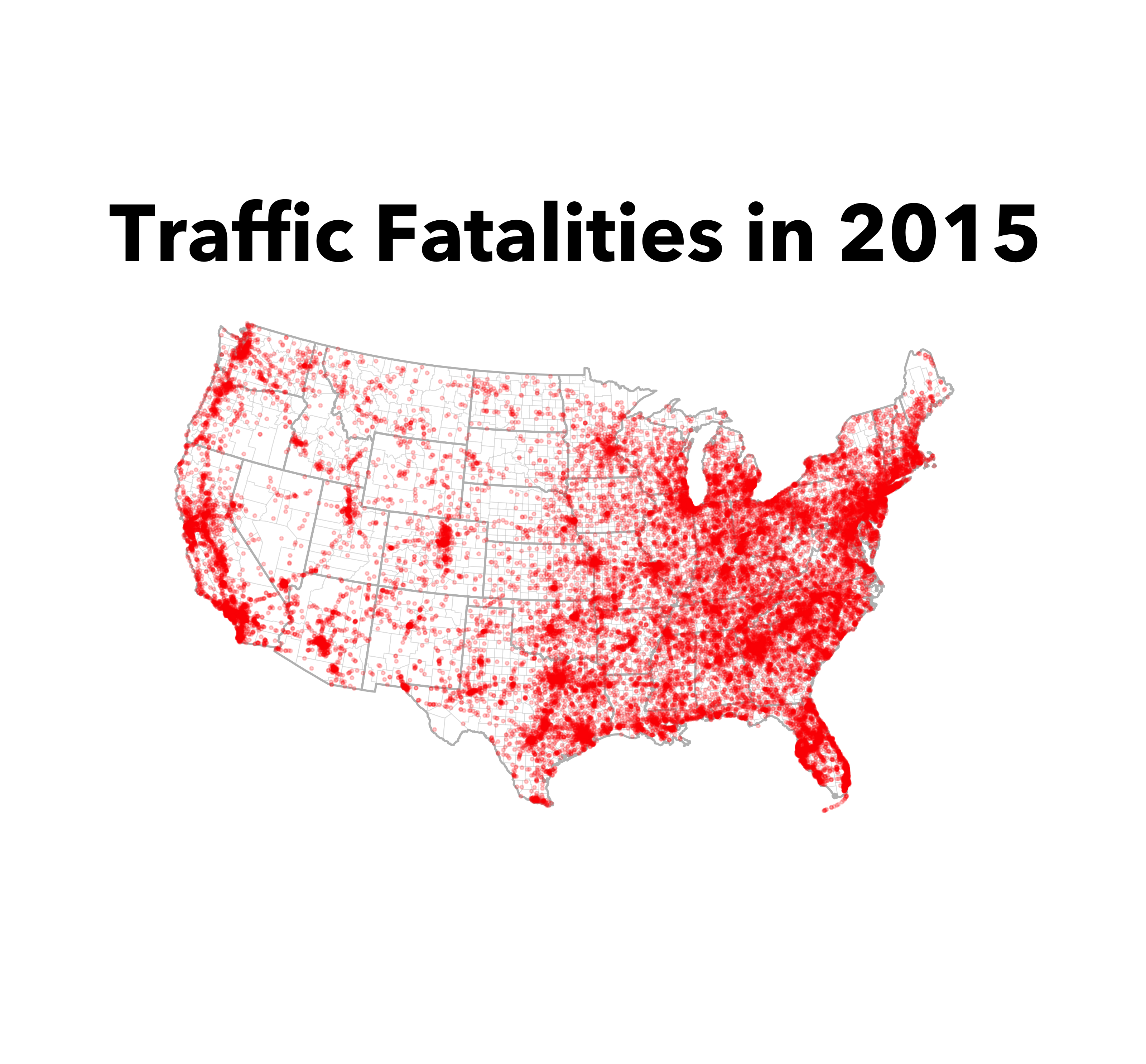
Hopefully with this post you’ll be well on the way to making maps of your own and can start exploring this data set and others like it. If you have any questions, please reach out on twitter. I’m available @lucaspuente.


Site Design: jmcglone ![]()